
Currently in rollout
Redesigning Sweetgreen’s home and navigation to fix the funnel’s biggest leak
Sep 2025 — Present
Katie Kim
Design Lead
Kally Vanderbilt
Product Lead
Elizabeth Harris
Engineering Lead
Overview
Most of Sweetgreen’s customers leave before ever starting an order — the funnel wasn’t leaking at checkout, it was leaking at discovery.
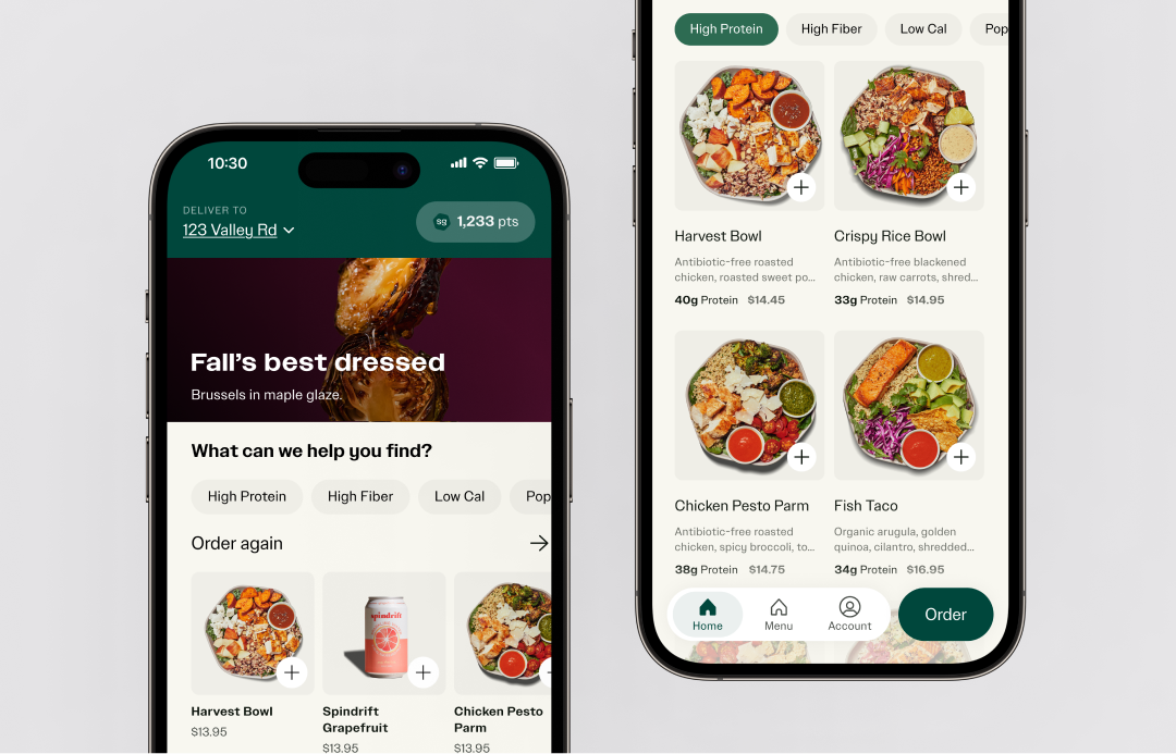
I led the redesign of the home screen and primary navigation to turn the entry point from a one-size-fits-all brand story into a personalized discovery surface. The redesign is currently in customer rollout.
The Challenge
How might we evolve the home screen to become the primary driver of personalized discovery?
Across web and mobile, 70% of sessions never added anything to the bag. While the brand widened the traffic funnel, those visitors landed on a home screen built to tell a single brand story, not to help them find their next meal.
The real bottleneck was intent and the product wasn’t capturing it early enough. A significant share of traffic bounced before ever entering the conversion funnel. The entry point was deciding whether a visitor became a customer — and it was doing that job passively.
Solution
A home that adapts to the customer journey.
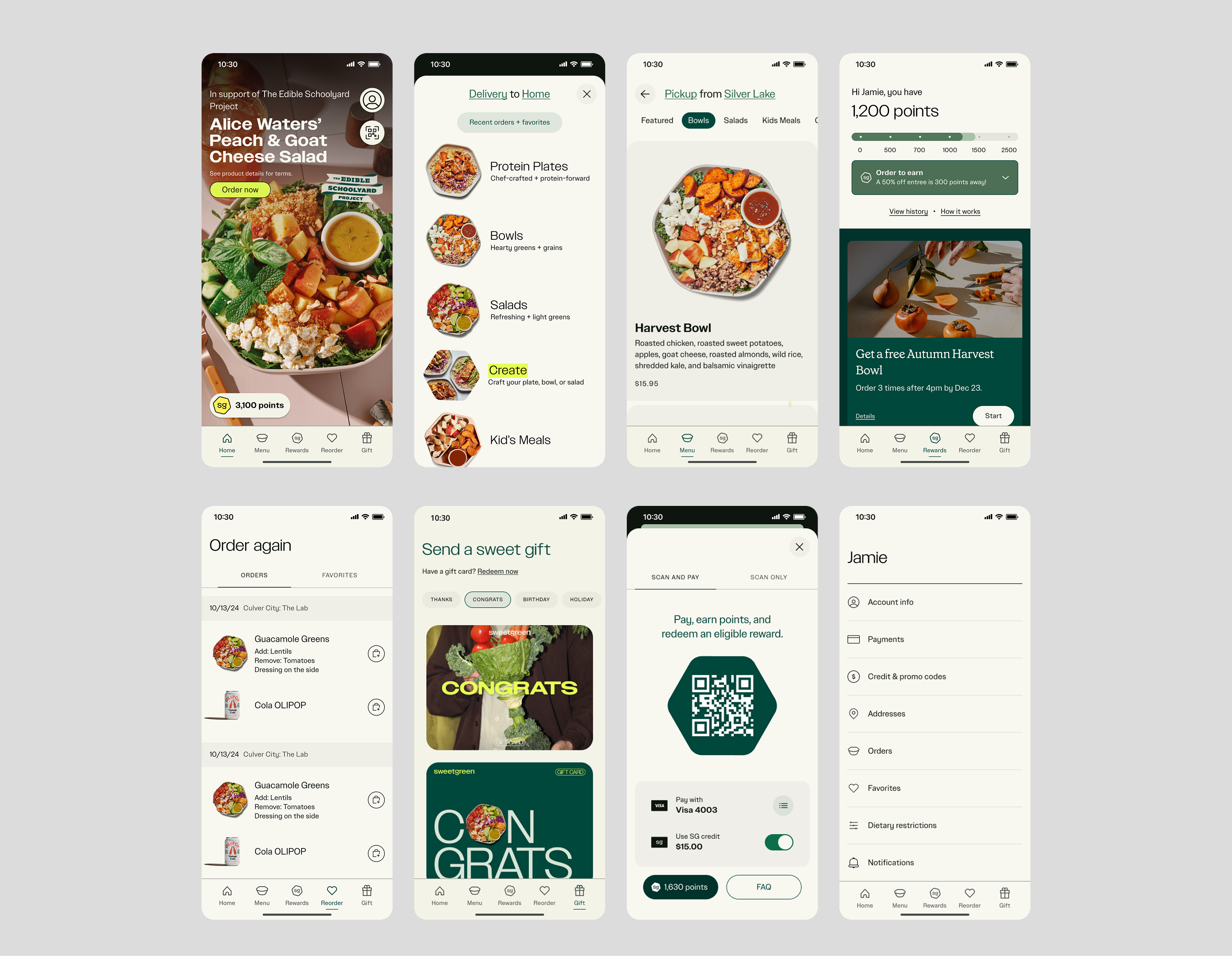
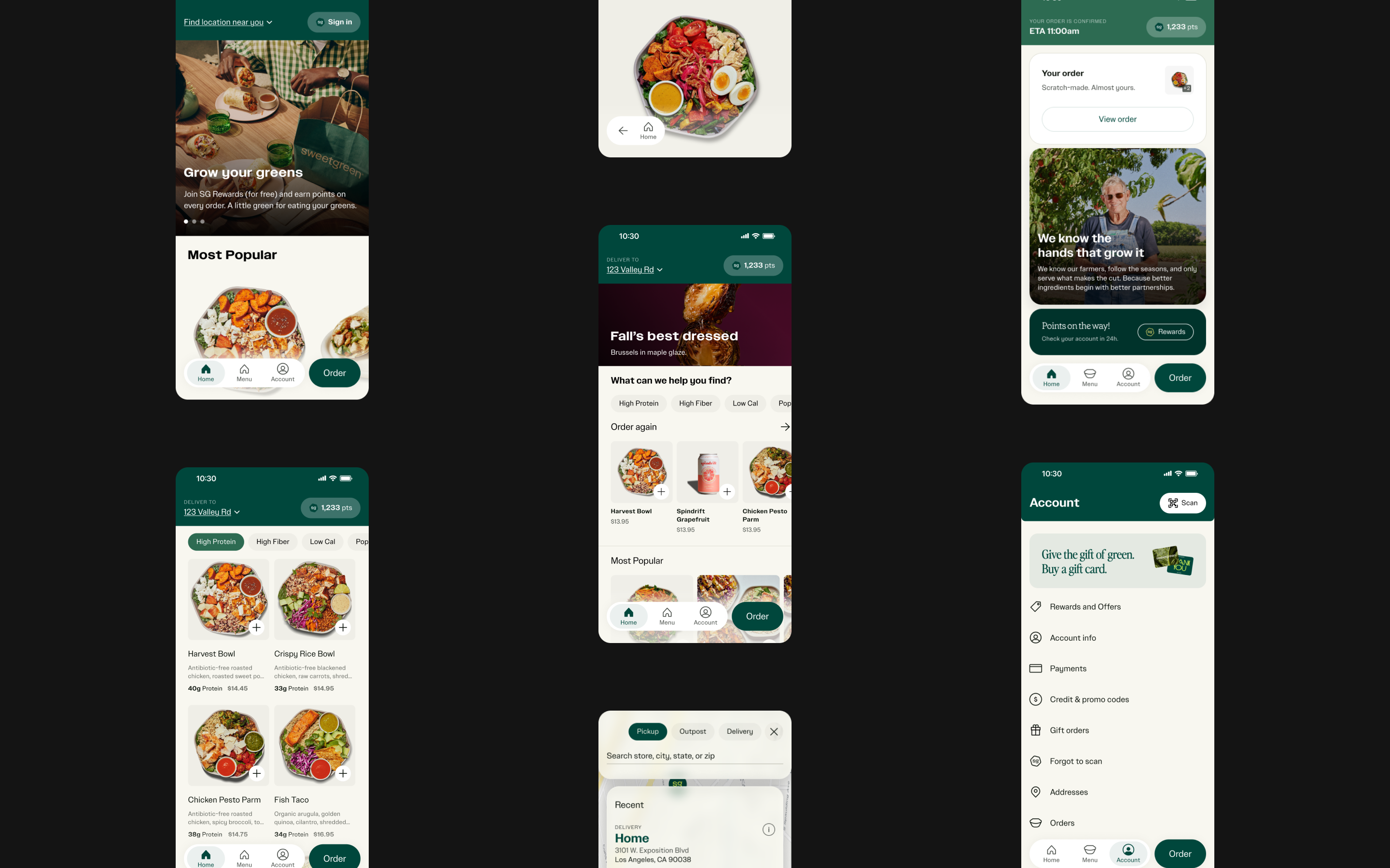
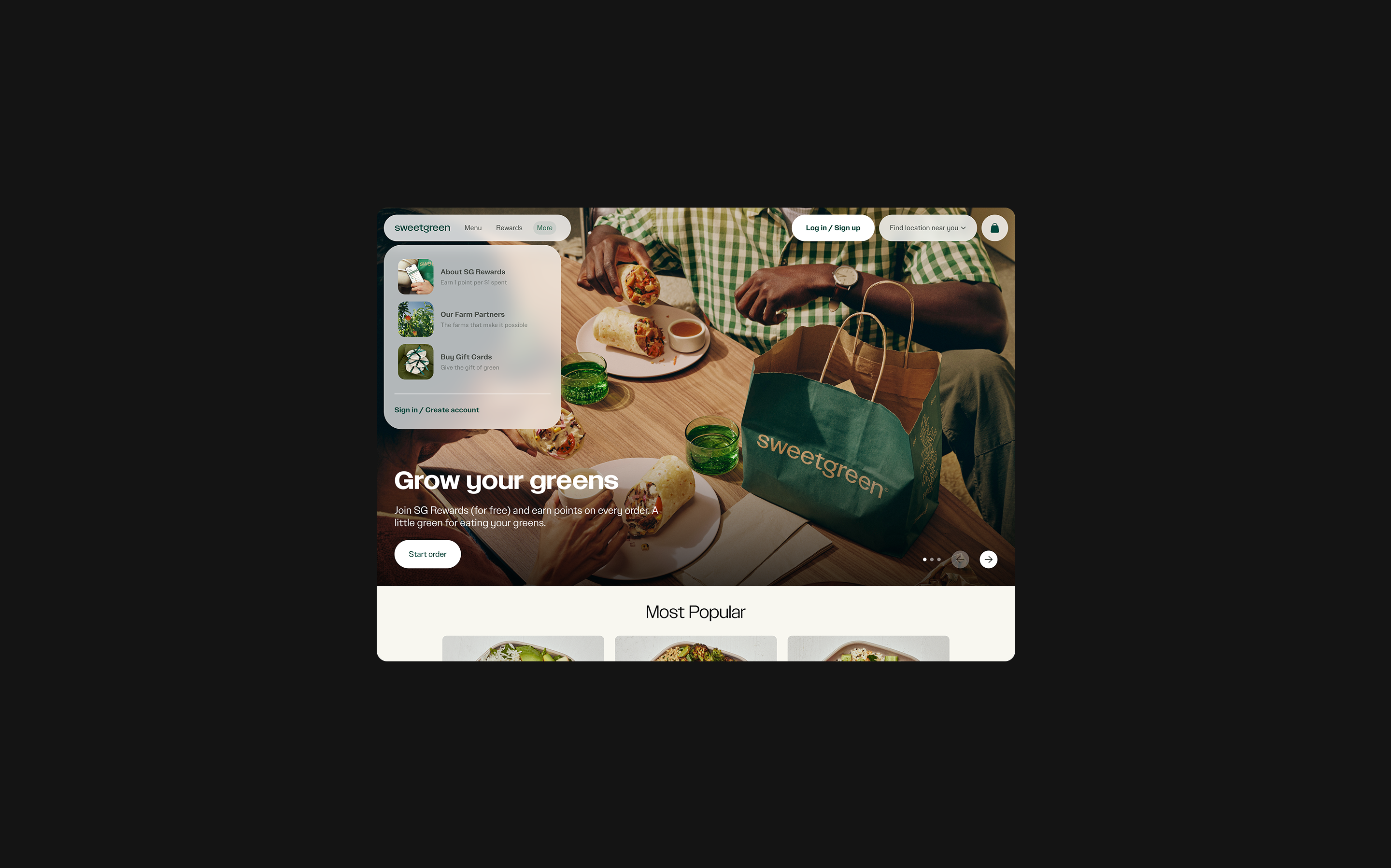
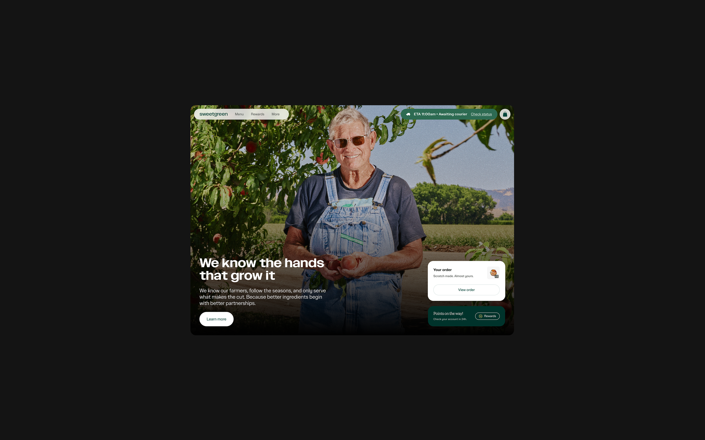
The redesign adapts to intent — a new visitor, a returning customer, and a post-order state each get a different, contextual surface, all built on the same discovery foundation.
- New user — leads with value messaging and elevates popular products with the highest return rate to inspire craveability and guarantee return.
- Existing user — opens with nutrition filters, “Order again,” and personalized recommendations to collapse the path to a great meal.
- Post-order — shifts to order tracking, order rating, and brand storytelling, extending engagement past the purchase instead of ending it.
The Bet
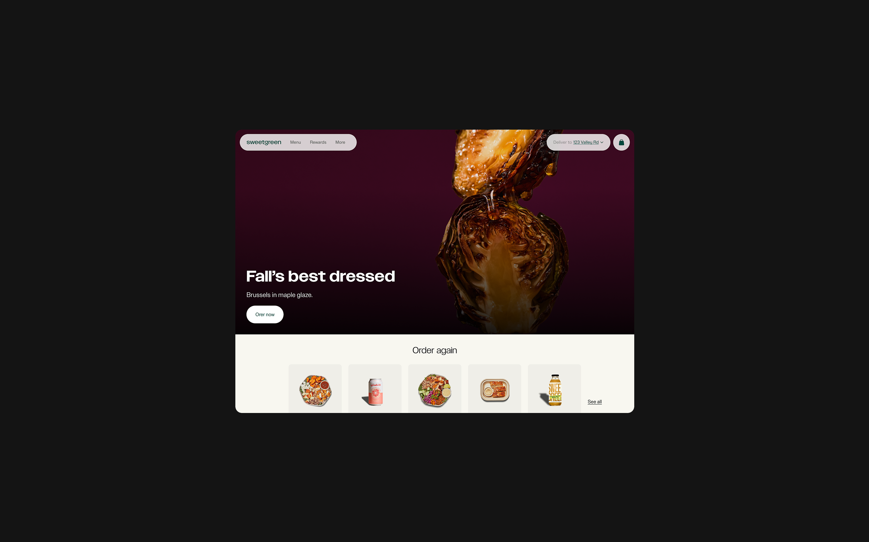
Replacing the full-bleed hero with a personalized Home would shift merchandising into a functional conversion driver.
The central, riskiest bet was to make Home itself the menu-discovery surface, rather than sending customers to the menu. The research had to prove that —
- Lower friction to entry by surfacing quick-access pathways — past orders, loyalty status, localized content — at first glance.
- Surface what’s worth exploring — new products and offers, and more curated brand experiences.
- Adapt to intent across the journey, including post-order states that build loyalty instead of ending engagement.
- Build a habit loop by supporting customers at every stage, not just at the moment of order.
Research
I tested the navigation across four rounds — two early first-click studies run as a makeshift A/B test, a larger validation round, and finally, a clickable prototype that tested complete journeys end to end.
Across these tests, first-click success on the core tasks climbed from 42% to 83% and the prototype confirmed the central bet: menu discovery via Home is not only expected but also preferred.
- ROUNDS 1 & 2 — FIRST-CLICK A/B (N=10 EACH)
Two rounds on identical first-click tasks isolated what was and wasn’t working. Average first-click success rose from 46% to 56% across seven shared tasks. The redesigned location banner nearly tripled success on “change address” (30% → 80%) — the clearest win. But four tasks were still failing: a new full-menu task cratered at 10%, the QR code and gift cards stayed stuck at 30%, and moving the bag icon regressed it from 50% to 40%. Those four failures became the explicit brief for the next round. - ROUND 3 — REBUILD & VALIDATE (N=38)
I rebuilt the mobile navigation around those learnings and tested it with a larger, more reliable sample. On the six tasks that carried through all three rounds, average first-click success climbed 42% → 52% → 83% — a 31-point jump in a single round. The tasks that had been broken through R1 and R2 became the app’s strongest: QR code 30% → 89%, viewing the bag 40% → 97%, sign-up 50% → 95%. Overall success reached 81% across all ten tasks. - ROUND 4 — PROTOTYPE, WHOLE JOURNEYS (N=24)
The final round stress-tested the design end to end on a clickable prototype — not just where people tapped first, but whether they could finish real journeys. The core journeys held: add-to-bag completed for every participant (100%), picking a menu item (83%), reordering (79%), and checking order status (75%) all cleared strongly. The signal that mattered most: on the “browse the menu” task, most participants discovered food through the Home-page filters rather than a separate menu — validating the central bet to make Home the menu-discovery surface.
Impact
The new app is in incremental rollout, beginning Sep 2026.